Challenge
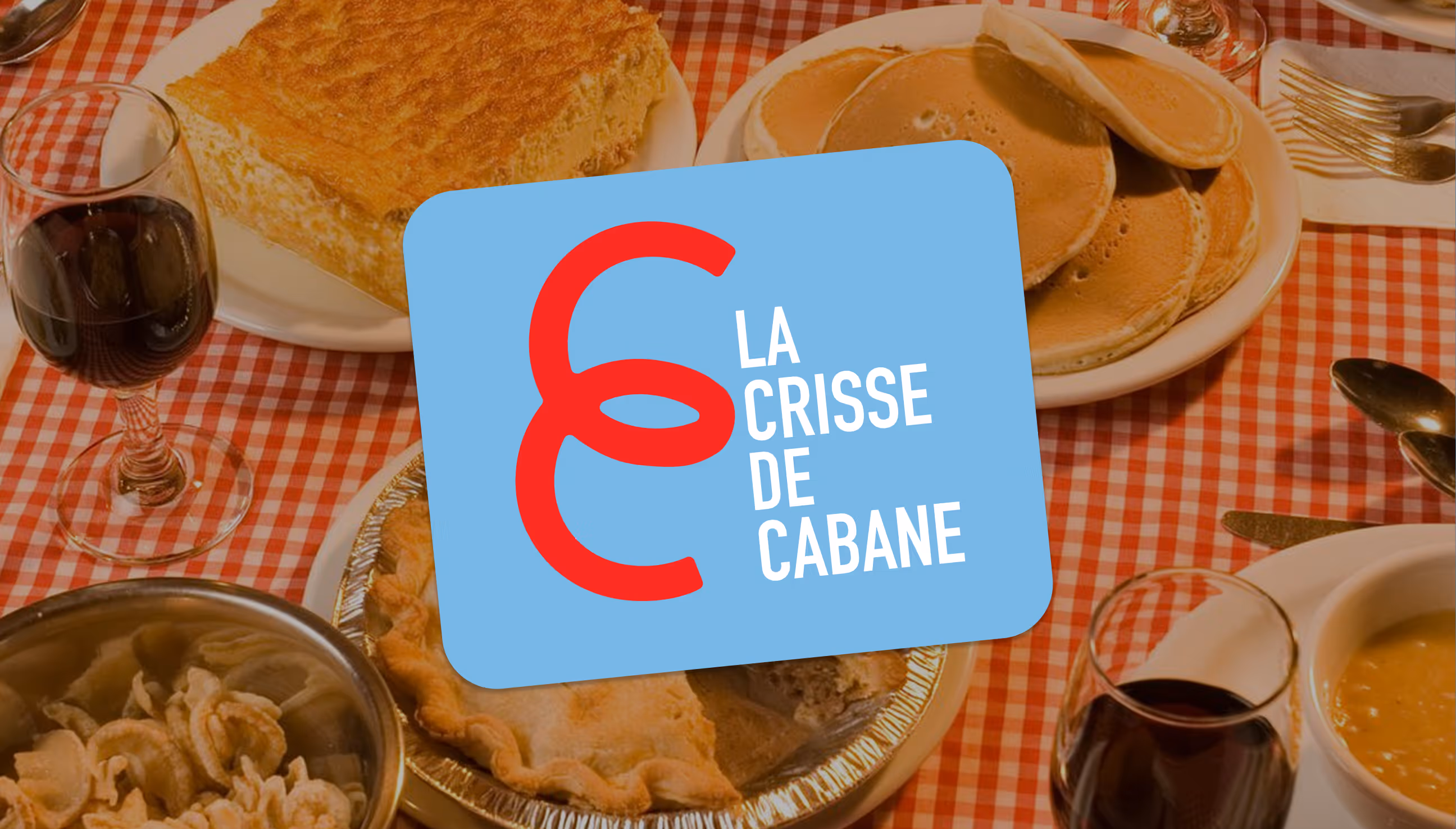
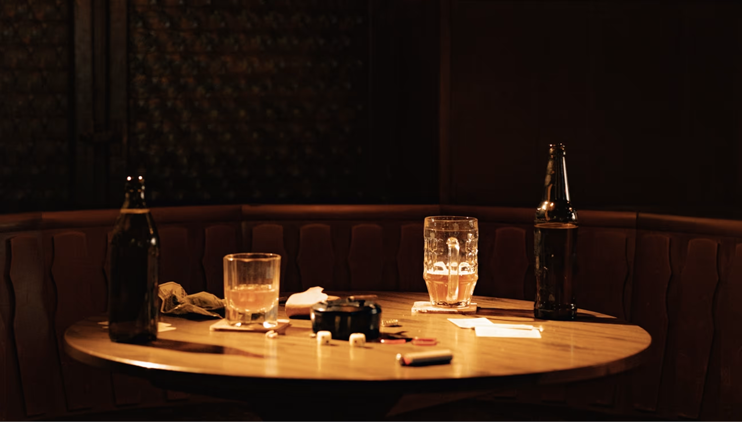
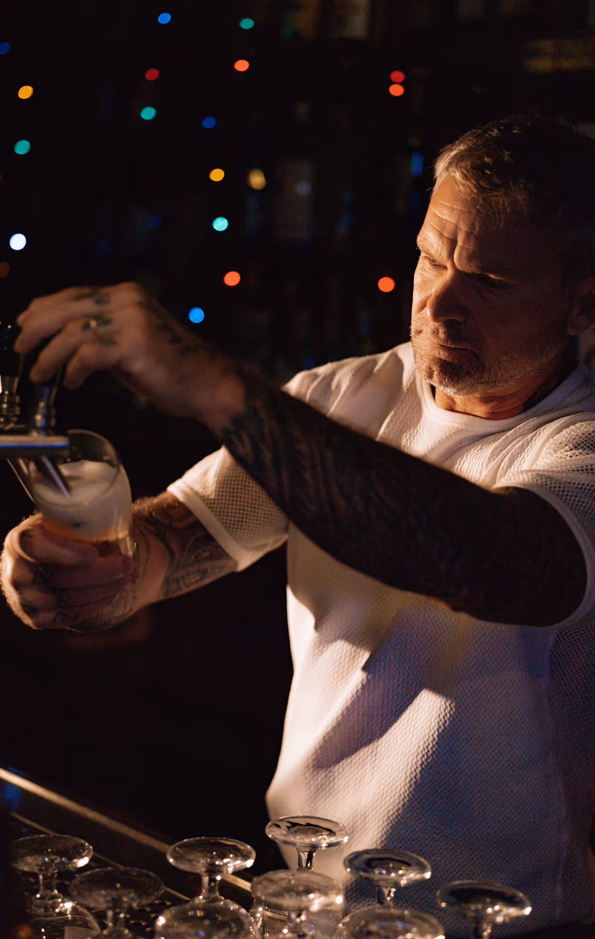
La Crisse de Cabane has been around for over 60 years. It's been a gathering place for the community since before most of the current regulars were born. The kind of spot that earns its place in a town not through marketing but through showing up, year after year. The rebranding came out of a question the owners had been sitting with: how do you honor that history while also opening the door wider? The town has shifted. So has the crowd. The shack felt like it needed to reflect that, not by shedding what it was, but by being more honest about everything it is. The identity had to carry a few different things. There's the cabane à sucre side; maple syrup, tire sur la neige, the whole Québécois tradition that goes back generations here. Then there's what happens after dark, when the tables move and the place becomes a bar. Both are genuine. The work was figuring out how to show that without one canceling out the other. It also sets itself apart from the typical sugar shack in one pretty straightforward way: it's open all year. Most cabanes à sucre are a March and April thing. This one isn't, which changes what it can be for the community and who it can reach.
Solution
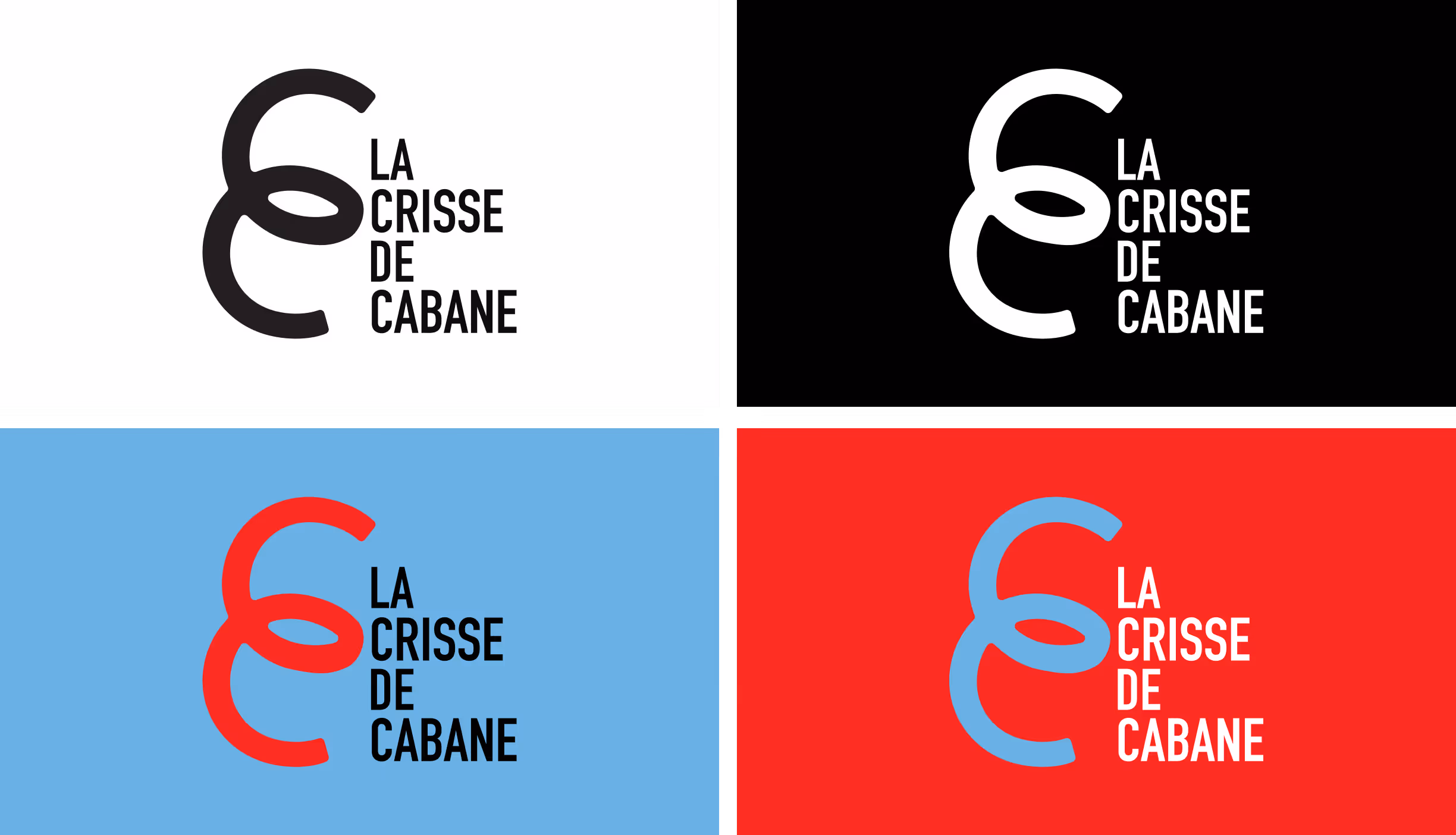
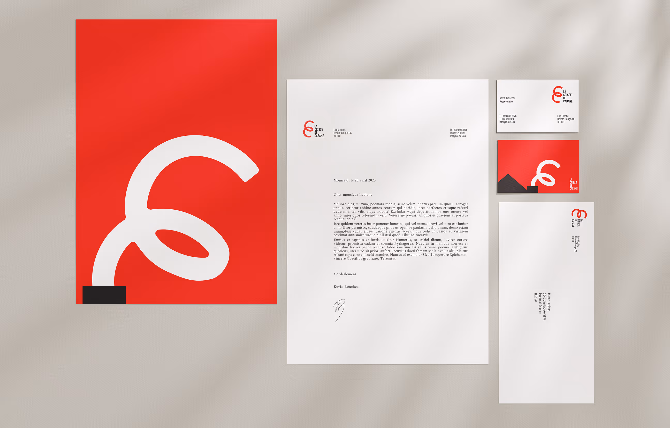
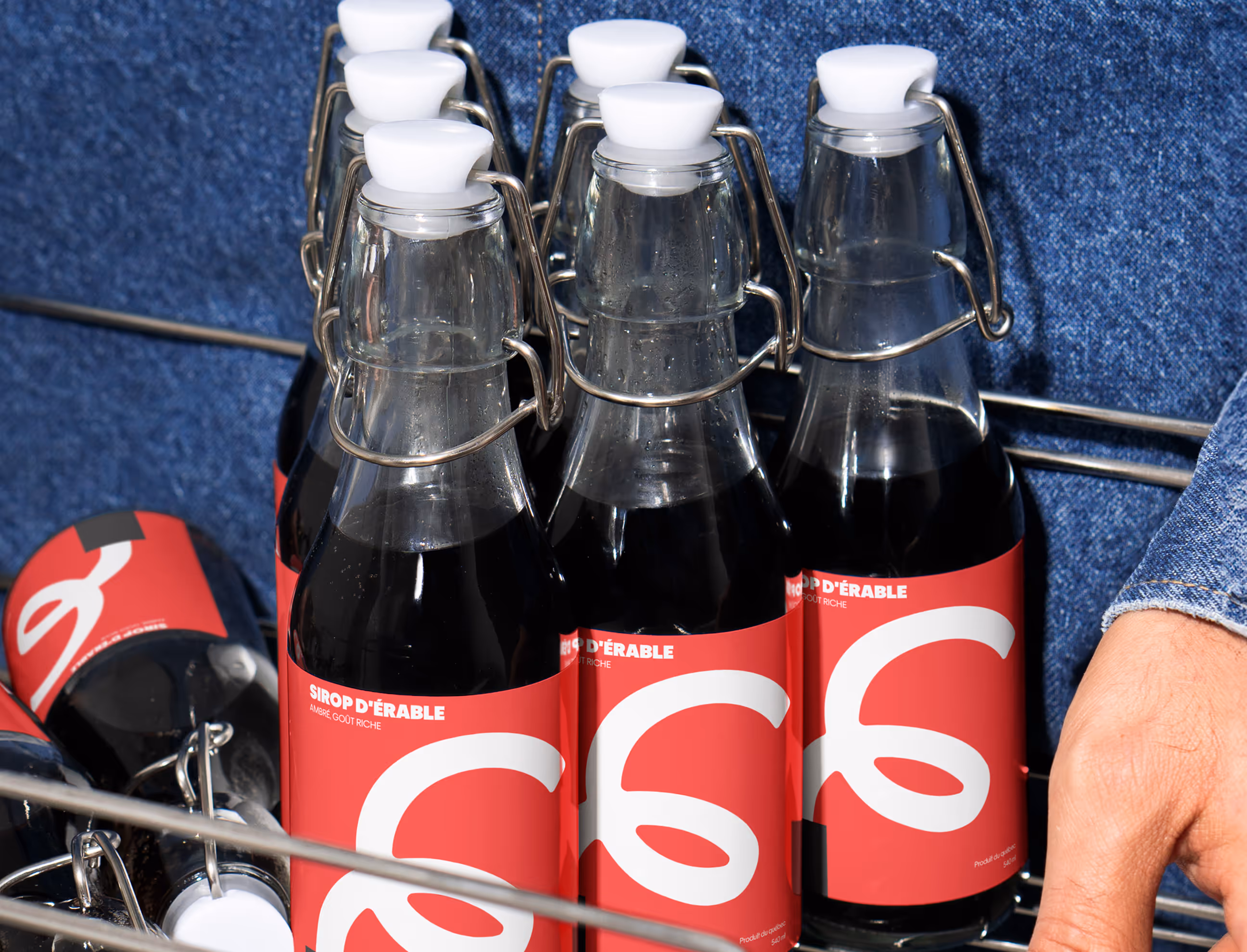
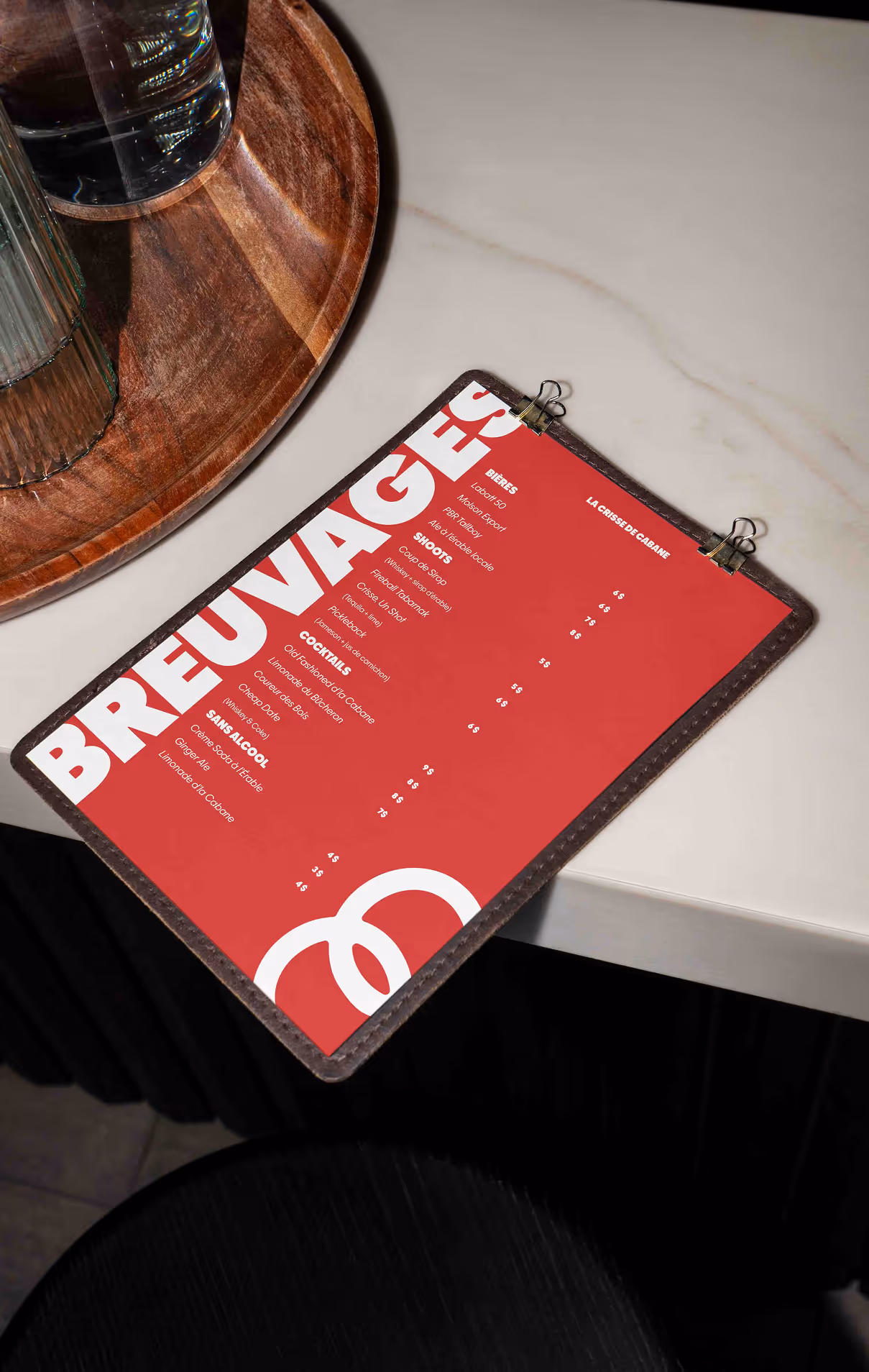
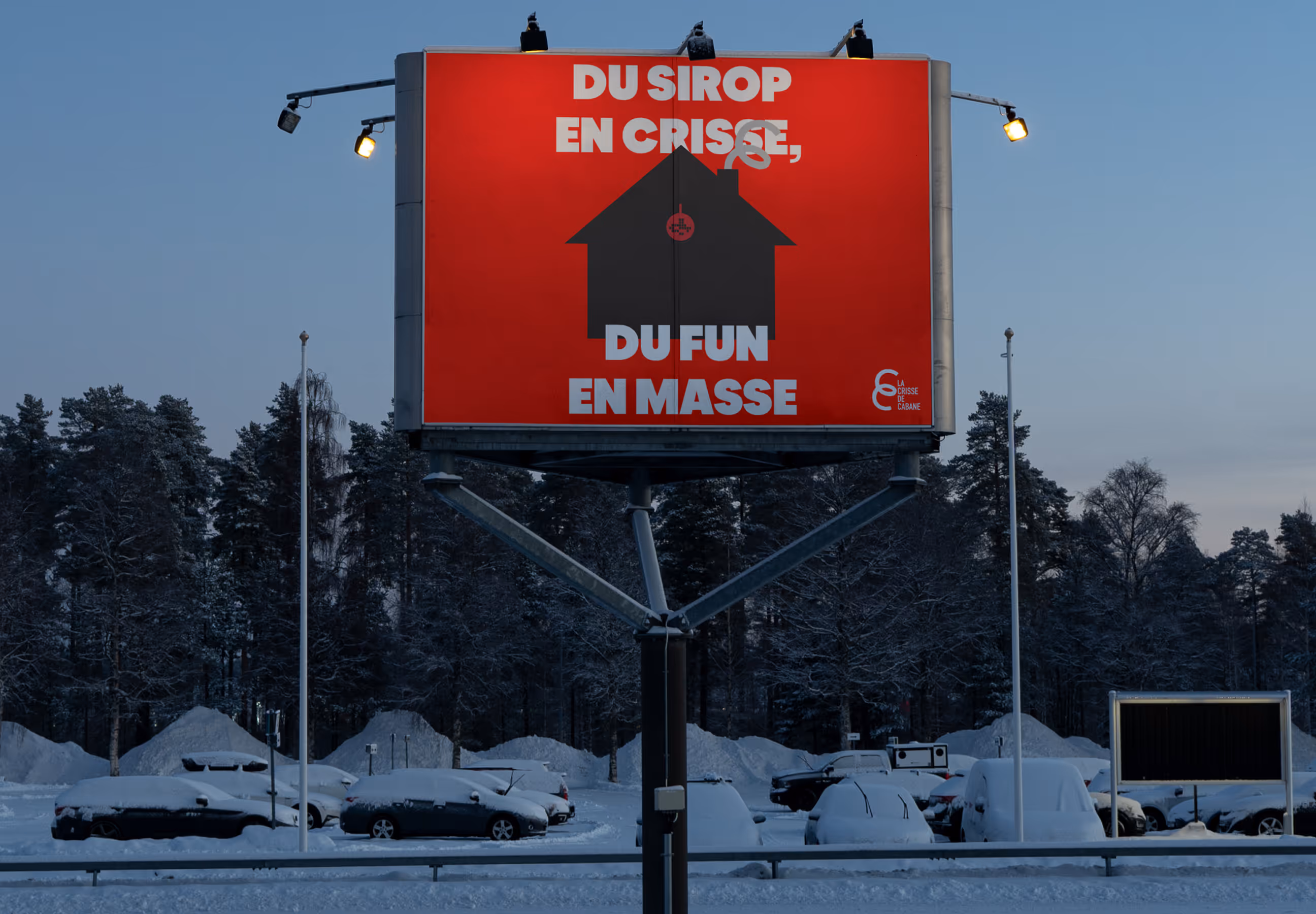
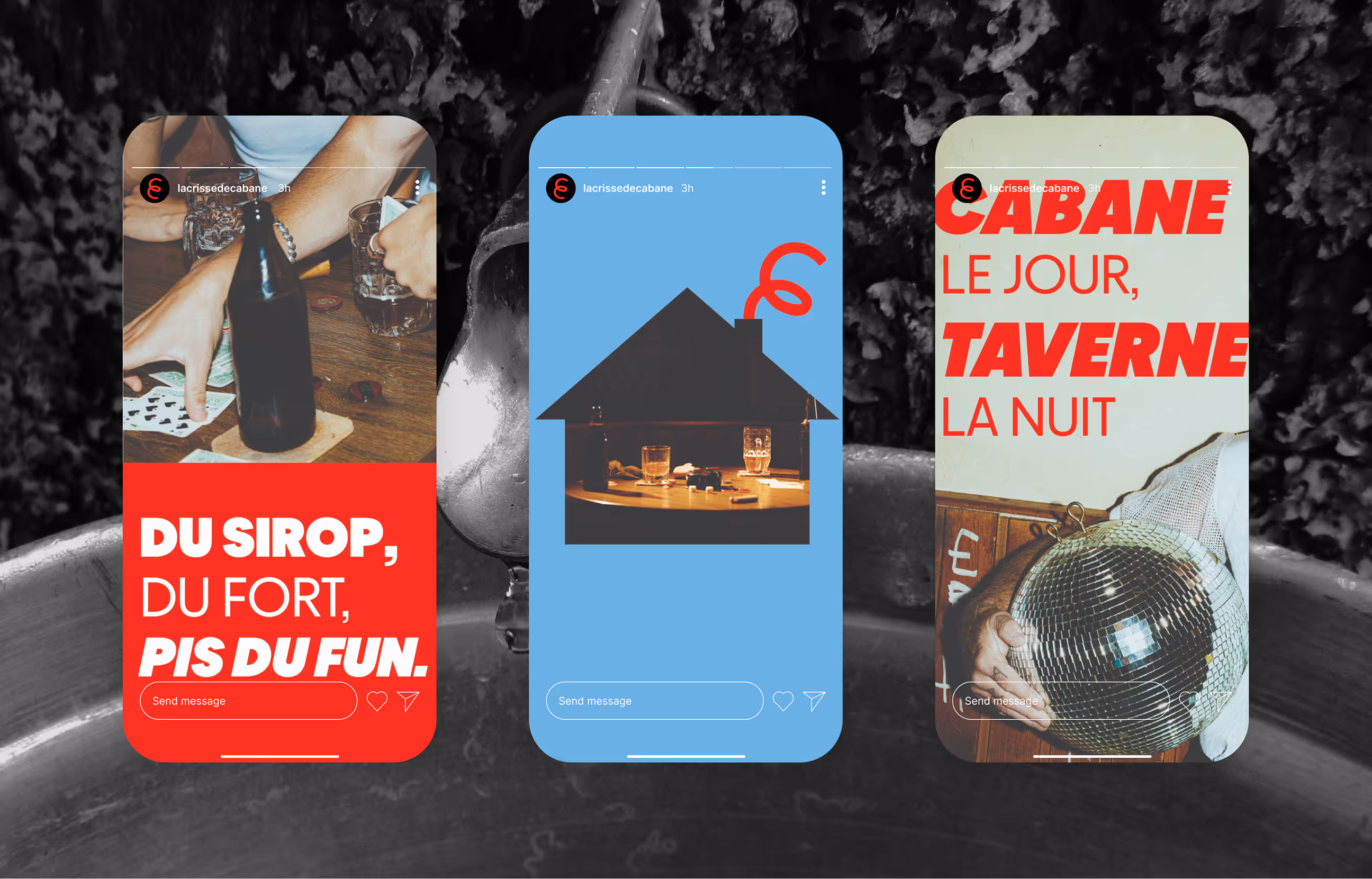
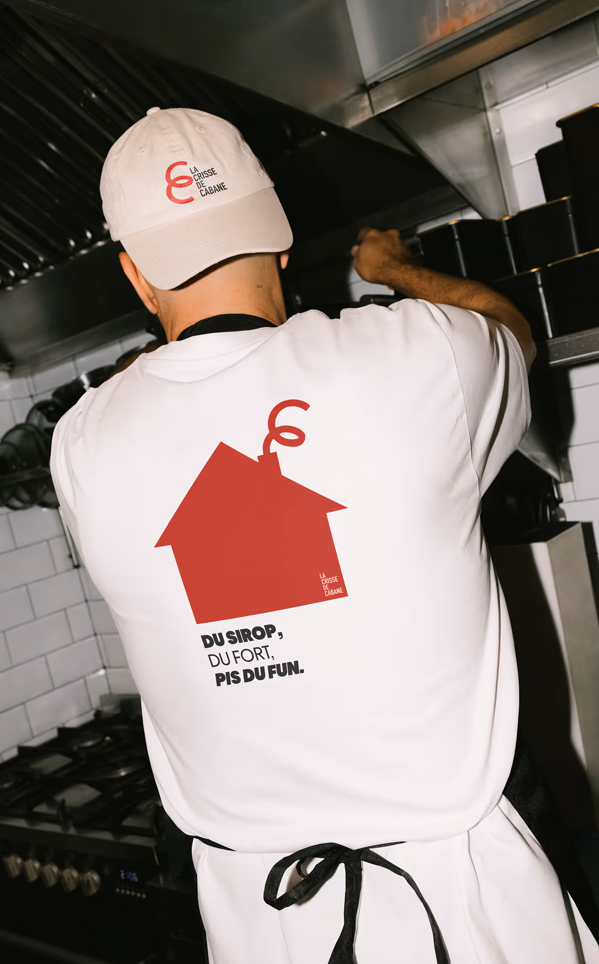
The name does a lot of work. La Crisse de Cabane is a play on oreilles de crisse, the crispy pork rinds that are basically mandatory at any proper cabane à sucre and crisse, which anyone from Québec knows isn't exactly polite language. That tension is the whole point. The name is a bit cheeky, a bit irreverent, and completely on-brand for what the place actually is. The logo runs with that. The two C's from Crisse and Cabane twist together into a shape that reads as both a pig's tail and the food itself. It's the kind of detail that rewards a second look. The colours come straight off a maple syrup can; that deep red and the light blue you've seen on those tins your whole life. Familiar without being nostalgic in a forced way. They're colours that already belong to this world. The typeface is clean and sans-serif, mostly to keep things from tipping too far into kitsch. The rest of the brand has enough personality; the type doesn't need to add to it.